How can I customize the appearance of my embeddable application?
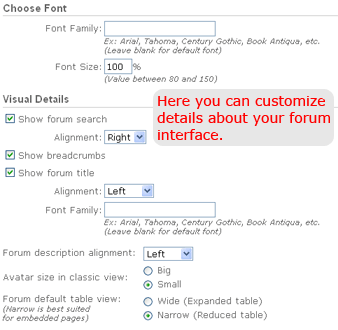
Go to "Options > Editor > Change appearance" link in your application. This screen has easy options to customize the basic look of your application:
If you want a more detailed customization, you can go to the "Look and Feel" section in order to provide a custom CSS (Cascading Style Sheets) text for your application.
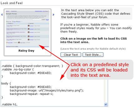
As you can see in the image above, Nabble has some predefined styles ready for you. You can simply click on them to get their CSS into the text area. After that, you can modify the text the way you want. This is a valuable source of examples that you can also use to learn more about Nabble's style.
How to write your custom CSS
If you want to change the appearance of your application, you have to override Nabble's style. The cheat table below can easily guide you through this process. Learn how each style is defined and change them as you want. Since colors may require hexadecimal codes, you can use a tool like Color Picker to help you in this sense.
| Item to Change | Default Value | How to Change (Example) |
| Font Font family and its size. |
Verdana 0.84em |
body, input, button, textarea, select { font-family: Tahoma; font-size: 0.8em; } |
| Background Color Background of the pages. |
FFFFFF (white) |
body, .nabble, .nabble .no-bg-color { background-color: #<color>; } |
| Text Color Color of texts (paragraphs, etc.). |
000000 (black) |
.nabble, .nabble table, .nabble .info-message th, .nabble .message-text, .small, .nabble .editor-table td, p, form, small, ul, table td, .breadcrumbs { color: #<color>; } |
| Link Color Color of unvisited links. |
0000EE |
.nabble a:link, .nabble a.not-visited-link { color: #<color>; } |
| Link Color (Visited) Color of visited links. |
551A8B |
.nabble a:visited, .nabble a.visited-link { color: #<color>; } |
| Header Text Color (H1) Color of header texts (big titles, etc.). |
333333 |
.nabble h1 { color: #<color>; } |
| Header Text Color (H2) Color of small header texts. |
000000 |
.nabble h2 { color: #<color>; } |
| Important Text Color of important texts. |
CC0000 |
.nabble .important { color: #<color>; } |
| Form Label Text Color of labels on forms and other special places. |
666666 |
.nabble th, .nabble .form-label, .nabble .weak-color { color: #<color>; } |
| Light Background Color of light backgrounds, which are used in some areas of the screen. |
F5F5F5 |
.nabble .light-bg-color { background-color: #<color>; } |
| Shaded Background Color of shaded backgrounds, which are used in some areas of the screen. |
EEEEEE |
.nabble .shaded-bg-color { background-color: #<color>; } |
| Dark Background Color of dark backgrounds, which are used in some areas of the screen. |
DDDDDD |
.nabble .dark-bg-color { background-color: #<color>; } |
| Error Message Color of error messages. |
FFFFCC |
.nabble .error-message { border-color:#<color>; background-color: #<color>; } |
| Info Message Color of info messages. |
FFFFCC |
.nabble .info-message { border-color:#<color>; background-color: #<color>; } |
| Highlight Color of highlights, which are used to catch user's attention. |
FFFF66 |
.nabble .highlight { background-color: #<color>; } |
| Light Border Color Color of the light border, which is used to separate areas on the screen. |
EEEEEE |
.nabble .light-border-color { border-color: #<color>; } |
| Medium Border Color Color of the medium border, which is used to separate areas on the screen. |
CCCCCC |
.nabble .medium-border-color { border-color: #<color>; } |
| Dark Border Color Color of the dark border, which is used to separate areas on the screen. |
666666 |
.nabble .dark-border-color { border-color: #<color>; } |
| Dropdown Colors Colors of the dropdown box. |
CCCCCC |
span.dropdown table { background-color:#<color>; border-color:#<color>; } |
| Dropdown Item Colors Colors of each dropdown item. |
0000EE (foreground / normal and hover) Transparent (background normal) DDDDDD (background hover) |
/* Normal */ span.dropdown-item { color:#<color>; } |
| Date Color Color used to display dates of messages. |
6A6A6A |
span.post-date { color:#<color>; } |
| Author Color Color used to display the author name on messages. |
116611 |
span.post-author { color:#<color>; } |
| Subject Color Color used to display subjects of messages. |
111166 |
.post-subject { color:#<color>; } |
| Message Preview Color Color used to display the message preview line (snippets). |
909090 |
span.post-snippet { color:#<color>; } |
| Post Hover Color Color used to highlight a post when the user moves the mouse over it. |
EEEEEE |
.post-hover { background-color:#<color>; } |
| Post Box Box where the post is displayed. |
D9D9D9 |
div.post-border { border-color: #<color>; } |
| Relationship Lines Lines that connect parents and children posts. This item requires images for the lines. |
N/A |
span.connect-line { background-image:url("<image-URL>"); } span.connect-end { background-image:url("<image-URL>"); } td.connect-end { background-image:url("<image-URL>"); } td.connect-node { background-image:url("<image-URL>"); } td.connect-node-closed { background-image:url("<image-URL>"); } |
If you still have questions, visit Nabble Help or the Nabble Support forum.
« Go Back
| Free Forum by Nabble |